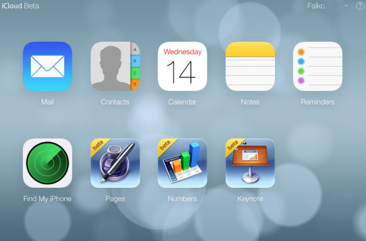
How Apple's Skeuomorphic iOS 7 Design Tricks The Brain; Even In Digital Life, It's An Analog World

Aside from more than 200 new software features, Apple’s new iOS 7 mobile operating system offers a viscerally improved experience in tactility for the user while maintaining its classic style.
Much of the newly unveiled iPhone’s visual and tactile appeal derives from a departure from competitors’ flat-design displays in favor of skeuomorphism — a rich layering of elements requiring the brain to take just milliseconds longer to decode, including color, space, shades, contour, and shadow, among others. That slight pause may be worth the trouble, many early adopters say, as the brain receives a much more detailed experience from the device.
In the digital world, skeuomorphism seeks to replicate physical objects in the “real” world with a rendering in 2-dimensions, like an artist creating perspective. Even online, we live in an analog world.
Reviewer Nishant Agrawal compares the layered look and feel to the flatter design of Apple’s competitors. “Gradually, you start understanding, and appreciating, the detail of skeuomorphism,” he writes. “There are many layers which separate the button from the background—shadow, color, gradient, border… You start to understand that each has a role to play, and together they give a unique individuality to the button.”
By contrast, the brain receives just two elements to decode when presented with the experience of the flatter design of many Android devices on the market and under development, testers say. Although this flatter design may at first appear superior, the brain begins to appreciate the richness of experience amid the melding of man and machine.
However, not everyone is a fan. Some reviewers opposing skeuomorphic design in graphical user interface say such metaphors for real-world objects on-screen disrupt the look and feel of mobile applications, rather than enhancing them. Moreover, skeuomorphic design emulates original experience not relatable to many users — exemplified by the 8-year-old playing with a graphic representation of an 8-track system. Creativity, too, may be hampered by unnecessarily tying abstract ideas to counterparts in the physical world.
Yet, Apple continues to believe, with this latest redesign, that reminders of the natural world may offer the brain the best and most simple way of interacting with the new.
Below is a video on iOS 7 from Apple:


