What Does The Hospital Of The Future Look Like? Designers Unveil Patient Room 2020
Walk into any patient room in any hospital and you'll encounter a multitude of items — a sharps container for needles, computer monitors, a bed, a height-adjustable dining table, equipment for measuring vital signs — all designed separately and mashed together in a small room. If that room contains a verbal patient, chances are they have something to complain about, whether it be the noise, the temperature, or the clutter created by all the aforementioned items.
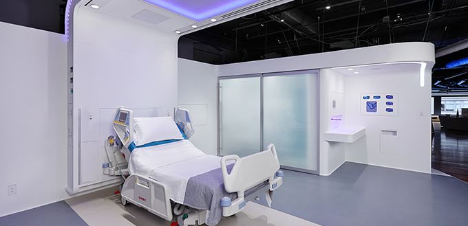
But patient rooms don't have to be that way. NXT Health, a non-profit sponsored by the Department of Defense, has designed the hospital room for the future, Patient Room 2020, now on display at the DuPont Corian design studio in New York.
With the help of Clemson University's Healthcare + Architecture Graduate program, the design team set out to apply the principles of design to healthcare, not only create an aesthetically pleasing patient environment, but to create one that changes caregiver behaviors and improves patient outcomes.
Healthcare, for a myriad of reasons, does not benefit from design in the way that other industries have. Like the physical hospital room, healthcare delivery and health systems are disjointed and disparate. While an initial look at the Patient Room 2020 might appear to be a lot of cosmetic and superficial changes, what it really hopes to achieve is a dramatic redesign of bedside patient care in a revolutionary way.
Patient Room Redesign: Aesthetic And Functional Changes
At first glance, the curved white panels, brushed aluminum fixtures, and lack of hard corners "make it feel like an iPhone," as described in a Wired.com review. Aside from looking good, the surfaces were designed to reduce areas where bacteria-laden dirt could hide. Non-porous solid surfaces manufactured by DuPont and anti-microbial fabrics supplied by Milliken Biosmart are more elements to limit germs that could lead to infection.
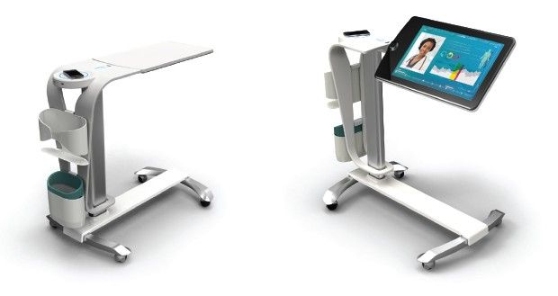
What appears to be the standard patient dining table flips over to reveal a tablet PC, with a large digital format and voice activation controls to increase accessibility to patients with limited dexterity or technological savvy. Known as the Patient Companion, the tablet allows for patients to call for help, check their medical progress, and control environmental factors, such as lights and temperature. The Companion could be used to play games and toggle through entertainment, alleviating patient boredom, a seldom addressed yet ubiquitous problem in healthcare.
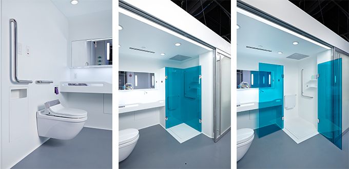
The layout of the room is arranged to prevent falls and injuries, which are all too common occurrences in hospitals, especially among the elderly. A direct path of travel between the bed and the bathroom is lined with continuous grab bars that are illuminated during the night. In the case that falls do occur, the rubberized floors reduce its impact on the body.
Changing Healthcare Delivery: Improving Outcomes, Reducing Costs
At the moment, Patient Room 2020 is more a concept on display than a reality. It's unknown if the room or parts of it will be adopted, but designers hope it will get healthcare administrators thinking about how to improve patient care on a systems-wide level.
While the price tag on outfitting a 300 bed hospital with rooms similar to Patient Room 2020 is far from inexpensive, there is a financial incentive for hospitals to adopt at least some of its elements. With the Affordable Care Act, hospitals will no longer be reimbursed for readmissions and care for incidents thought to be a hospital's responsibility, such as hospital-acquired infections and injuries resulting from falls.
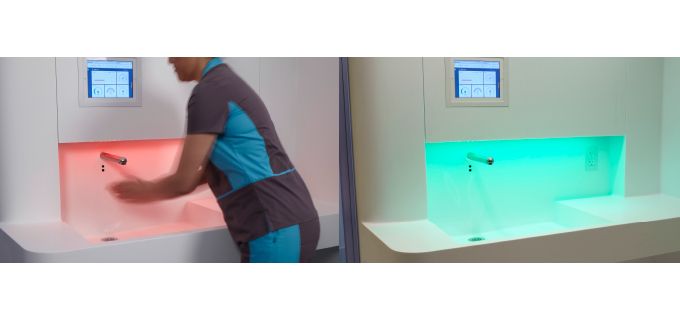
One salient example is a clever solution to the troubling problem that healthcare workers fail to wash their hands between caring for patients. When a caregiver enters the room, the sink turns red reminding them to wash their hands. As healthcare workers' hands are a primary mode of transmitting costly infections, the lack of handwashing is estimated to cost $30 billion and 100,000 lives a year.
NXT Health's redesign, led by Salley Whitman, seeks to remedy the disjointed healthcare system at large. At the footwall of the room is a large screen, which can be used by both patients and healthcare workers to pull up health information, and video consulting between specialists and primary care providers a patient would see normally outside the hospital. The blood pressure cuff could be dismounted and taken home by the patient, just as the software used to measure a patient's vita signs can be taken home as an app. The idea is to the technologies and health tools available inside the room to be used by patients outside of it as well.
"We think that design has the power to revolutionize industries, just as it has in electronics, in cars, in everything else," Whitman said. "In health care, we haven't tapped into that in a systematic way"


Published by Medicaldaily.com


