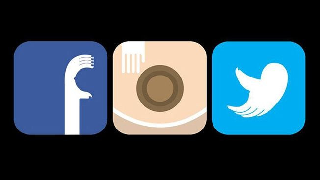
Breast Cancer Awareness Month Gets Social Media Facelift, As Agency Redesigns Popular Logos

You know October is breast cancer awareness month, but did you know more women check their social networks more than they check their breasts? At least that’s the premise of a new visual ad campaign from DDB Singapore and the Breast Cancer Foundation. Since a woman that’s familiar with the normal look and feel of her breasts is better able to spot any abnormalities, the two organizations have teamed up to try and reverse this occurrence by tweaking the logos for Facebook, Instagram, and Twitter.
As reported by AdWeek (also as seen by your own eye when you check out the ads), “the familiar logos have been redesigned to anatomically pay homage to breasts and remind you to perform an exam — on yourself, or someone you care about — as frequently as you check your social feeds." Each logo includes the headline, "If only you checked your breasts as often," as well as a message that more or less states missing newly uploaded photos or messages isn't the end of the world; breast cancer often is.
In addition to their designs, DDB is also urging people to appeal to these social networks to actually use these logos throughout the month of October. It's a pretty awesome and ingenius idea, if you ask us, considering the 80 percent of 18- to 44-year-olds who check their smartphone within the first 15 minutes they wake up. Business Insider declared social media as the top Internet activity, too, so imagine the impact these logos could have on breast cancer prevention.
Photos courtesy of the Breast Cancer Foundation
Published by Medicaldaily.com


